
With all of the hundreds of thousands of photo editing iOS and Android apps available these days, creating beautifully crafted photos and prints is in the palms of our hands. Which is good, because I suck at photoshop.
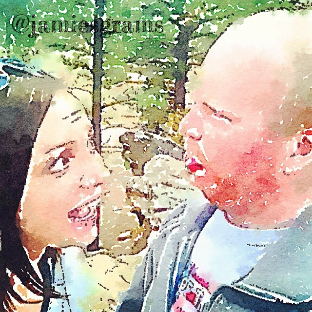
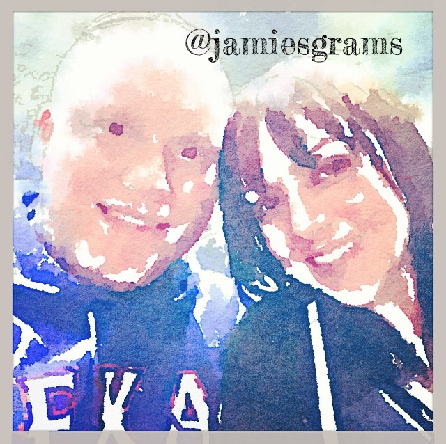
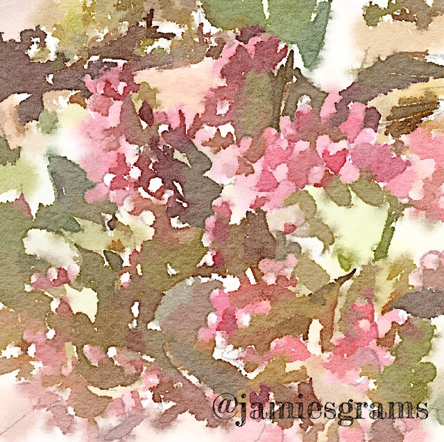
Confession: I’m a little bit addicted to the Waterlogue app. If you haven’t heard about it yet, you might not be on instagram. It basically makes any photo into a watercolor; and I could watch it work it’s magic ALL. DAY. As demonstrated by just a few of my grams…

After playing with the app for a few days I knew I wanted to use it for some real life art, so I started combing through all of the phone pics I’ve taken over the last two and a half years (around 3,500 – eep). I landed on flowers, because watercolors of flowers are the best kind of watercolors.

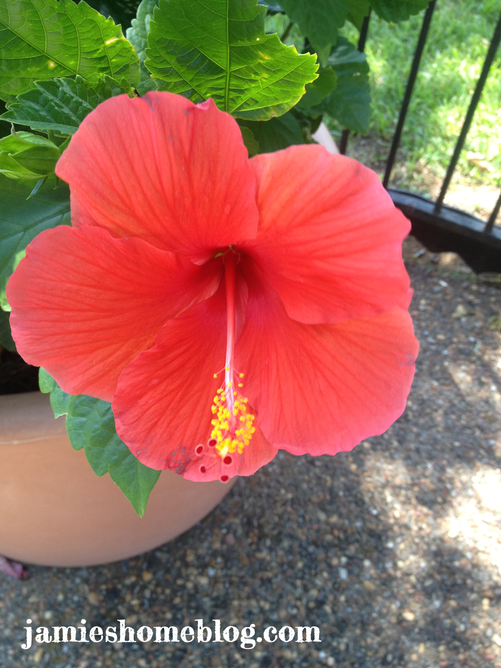
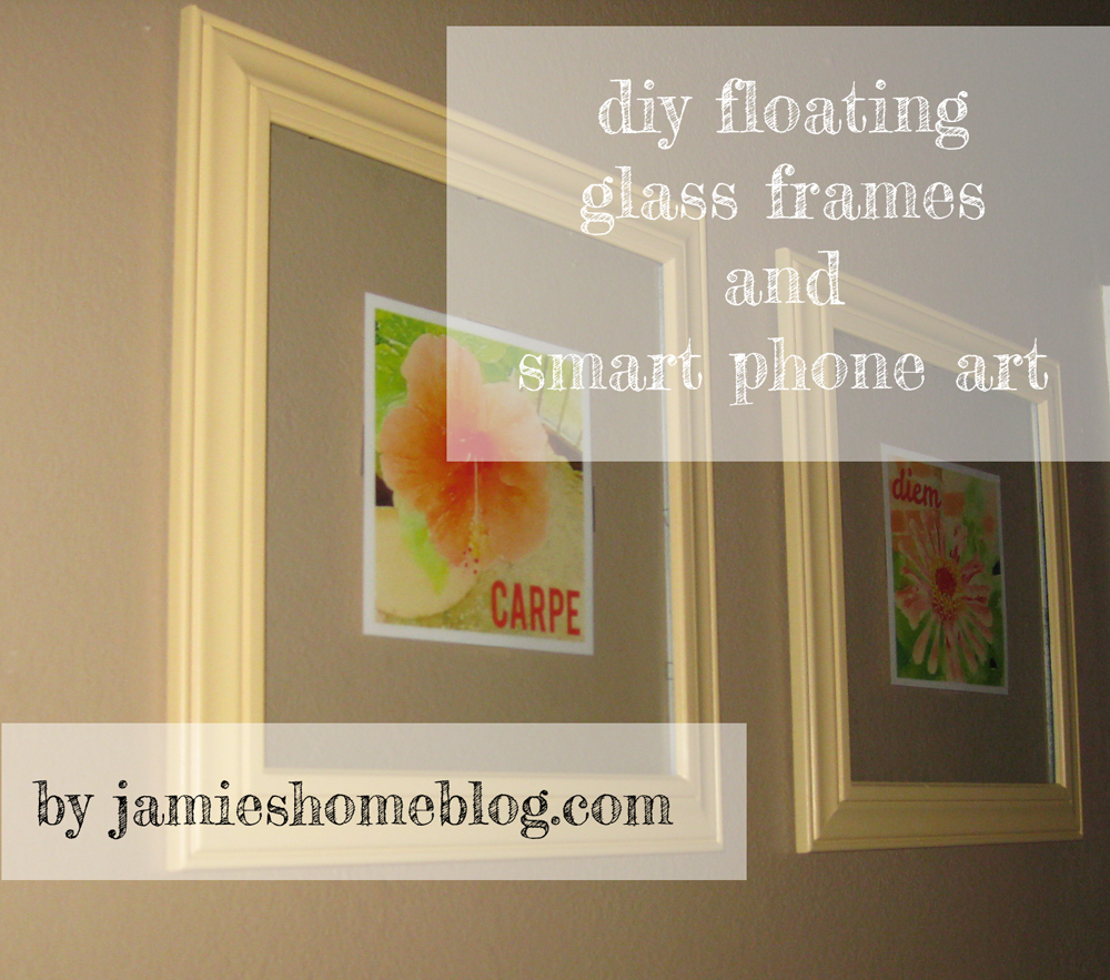
The first is a picture of one of my zinnias from my garden two years ago and the other is a hibiscus planted by the pool in our complex. The flowers are both so beautiful and both pictures have similar colors so methinks they’re a delightful match.
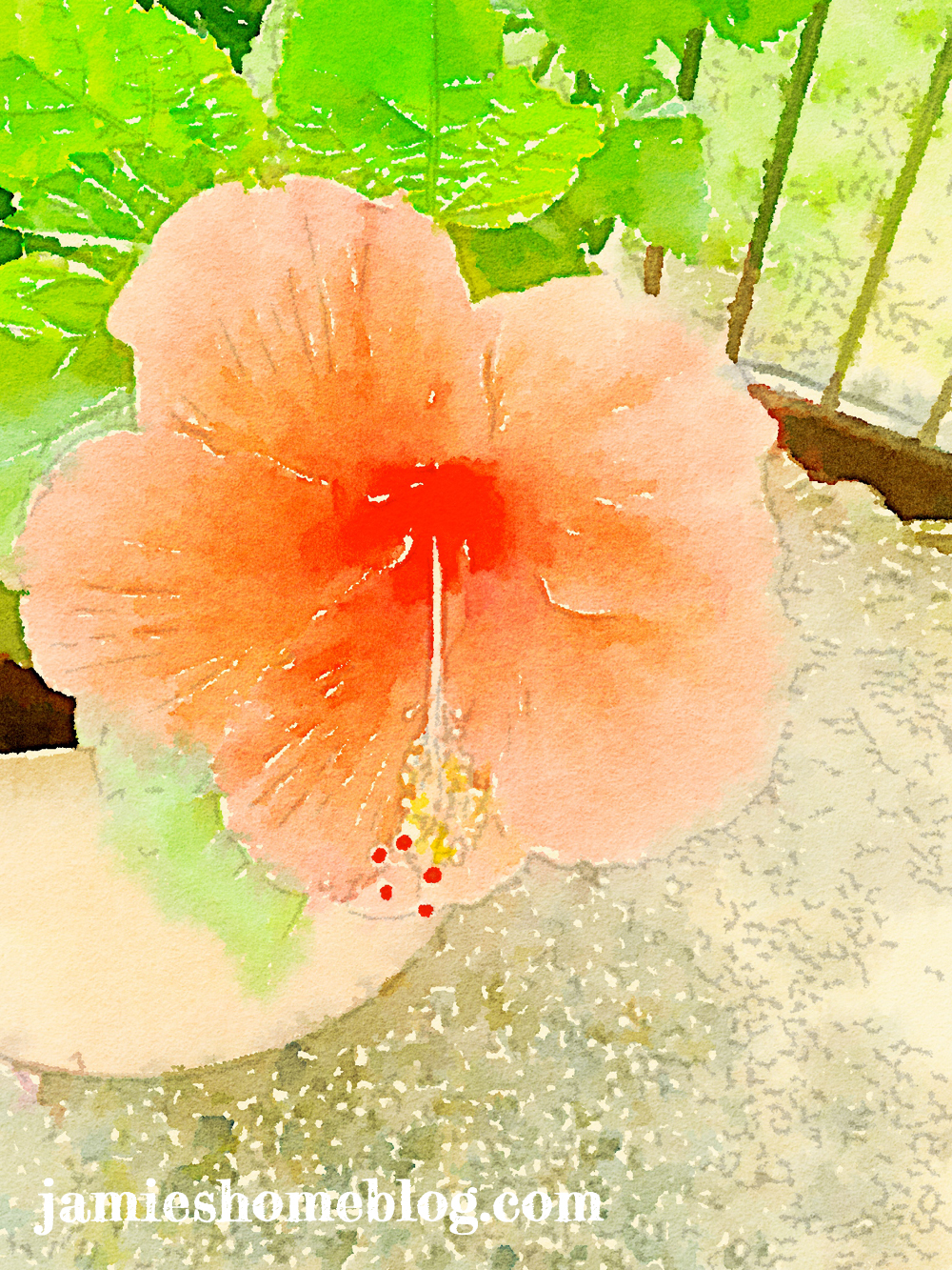
This is what waterlogue did to them (using the “travelogue” filter) – swoon.

Then I decided to add one of my favorite, albeit cliche, quotes. I pulled the pics into my Rhonna Designs app to add text.
Lets stop for a second… If you like to jazz up your pics with text, pattern or doodles, Rhonna’s app is worth every single penny. There are so many beautiful quotes, textures and designs within the app that I’ve literally spent hours playing around in it before. Rhonna doesn’t know me from Adam (nor does Waterlogue by the by), I just feel like I need to give her, and the inspiring thousands of RD app users in her social community some props for creating such a positive and encouraging little corner of the interwebs. You go, Rhonna!
Back to it… I brought the hibiscus pic into my Rhonna Designs app, chose a simple font and a favorite color, did a bit o’ typing and boom… my pic said CARPE.

Next, the zinnia. Same color, different text and boom… diem.

PS I have zero typography knowledge and about the same amount of design skills, but I do know that I like the look of a sans serif paired with script so that’s what I did. My advice if you’re doing a similar project is to explore whatever tools you have at your fingertips and spend time playing around and studying what you’ve done to see what speaks to you.
I printed them out on some nice heavy card stock because its durable and I like the look of it. I used my paper slicer to cut off the excess paper.

So lets talk about what I used to frame them, yes? These 13.5″ square frames (17.5″ including the frame) with uhh, gambling prints (?) were a freebie from the fella’s mom’s coworker (try to stay with me). The price tags on the back said they were $59.99. A piece. That’s a lotta dough, yo. I’m lucky to know folks that will give me things like this for free!
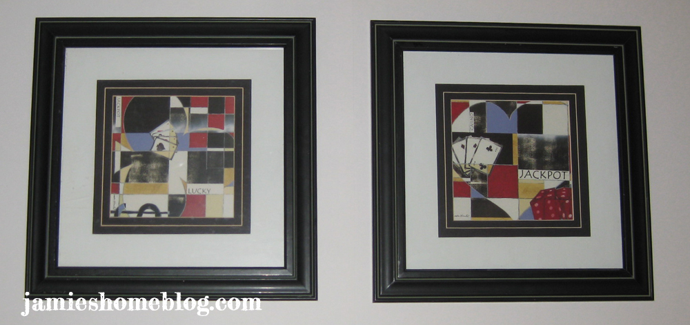
I’m not much of a gambling artwork enthusiast – different strokes, different folks. I gladly accepted the free frames knowing that I would paint them at some point. The paper backing came off really easily, but the matting / print was staplegunned in. I used needle nose pliers to pull them, but it wasn’t easy and I scraped my hand a little. This is why protecting your hands / face etc is important people! I had my protective glasses on but not my gloves. Bad Jamie.

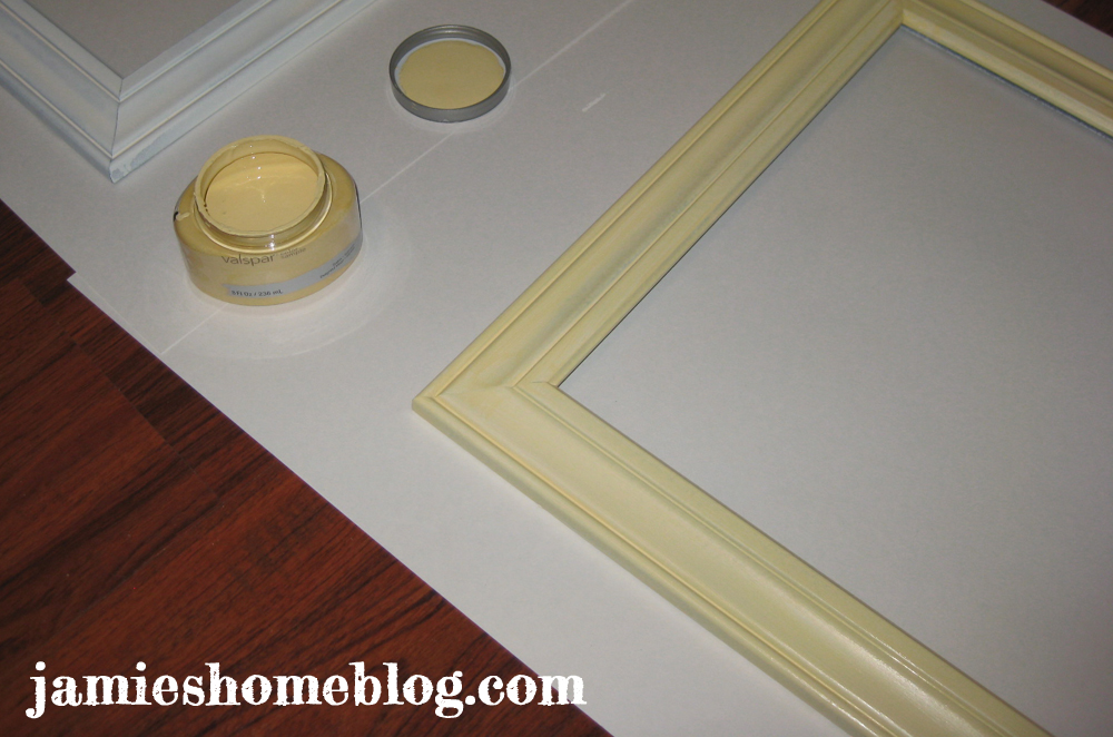
After I pulled 30 some staples out of each frame I primed them (Zinsser B-I-N spray) and painted them using some of my leftover Delightful Moon by Valspar, which I also used on some art in my living room.
As for how I turned them into floating print frames… I faux’d it. I just took regular ol’ scotch tape and taped the edges of the prints down – after I centered them, of course.

To keep the glass in, I broke out my staple gun. To keep the recoil from the staple gun from cracking the glass, I folded a tea towel and laid it between the glass and my staple gun like so:

It worked quite nicely! Which I’m super happy about, because I thought of it on the fly, and I wasn’t sure it was going to work.
Anyway, just like that they were ready to be hung! I used my laser level (by far one of my most worthwhile purchases) to make sure they were level and hung them in our office / guest room in a place visible from my desk.


I may add another glass panel to the backs one day to make it them true floating glass frames, but I like the idea of being able to just pop these babies off of the wall and add new prints as the seasons (or even my moods) change.
I hope this post has inspired you to create some pretty prints of your own! Anyone else out there using their smart phone to decorate their house? Maybe you’re so busy waterloguing that you don’t have time to think about decor? Do tell…

I am a lucky guy to have a very creative Jamie!
Well I get it from you! Love you Pawnee! 🙂
Pingback: String Art – a “How [not] To” | jamie's home blog
Hurrah, that’s what I was searching for, what a data!
present here at this webpage, thanks admin of this website.