
Yep, I have more wall art to talk about! We have LOTS of wall space too, so this is definitely not the last post to be written on the subject here at Jamie’s Home Blog…
Between the mixture of bachelor and bachelorette furnishings that my fella and I combined when we moved in together, and the lack of wall decor or even a headboard, our bedroom wasn’t much to look at. As I’ve said before, apologies for the muddy iPhone pics…

One day, while I was not at all sitting in a meeting, I doodled this:

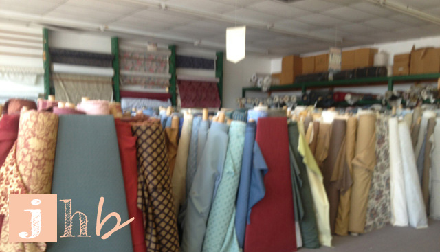
Recognize the bench? That drawing was the idea I had for our room. Simplicity with a touch of mid-century. And this is the story of the wall art in that doodle. One face-melting hot sunny Texas day, my Mom and I went garage sale hoppin’. Well, first we went to this great little hole in the wall fabric shop that had no air conditioning. We were basically surrounded by fabric insulation in a smallish room on a 100 degree day… and it was only about 10am at this point.

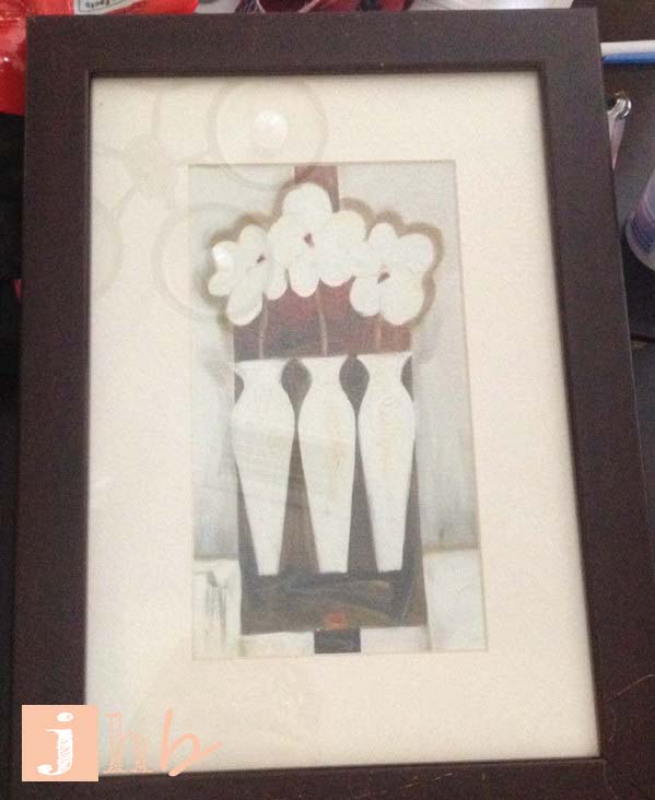
But I digress… At one of these garage sales we visited I came across six 8.5″ x 12.5″ frames priced at $2 per. I offered up $10 they were mine! I’m sure I could have haggled her even lower but I had a $10 on me so that made it easy. The art wasn’t my style but that hasn’t ever stopped me from purchasing useful frames for sure!
I lucked into finding some Krylon Coral Isle at my local Jo-Ann. I’m not sure that color is regularly sold in my area. I looked for it at several locations of a big retailer that carries Krylon (you know, the dreaded “W”) and didn’t find it! So you better believe I bought all three cans that were on the Jo-Ann shelf! I demonstrated my love for the color with this fancy Instagram.

You know how the process works… Spray a coat of primer (I prefer Zinsser BIN) and several light coats of paint.

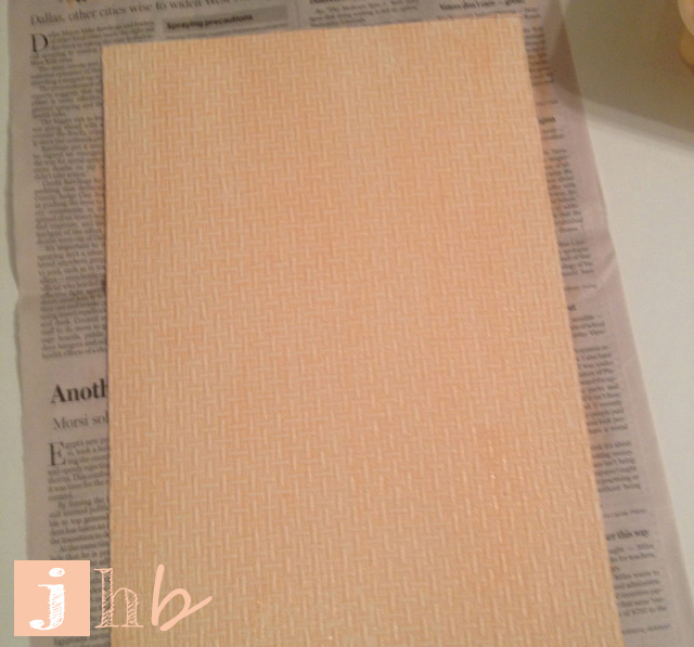
Then it was time to make the art! I still have tons of leftover Allen + Roth basketweave textured wallpaper from my dresser project. I affixed it to poster board with spray adhesive and then cut it to fit my frames, using the original art as my template for size.

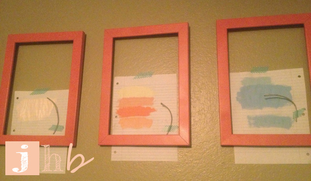
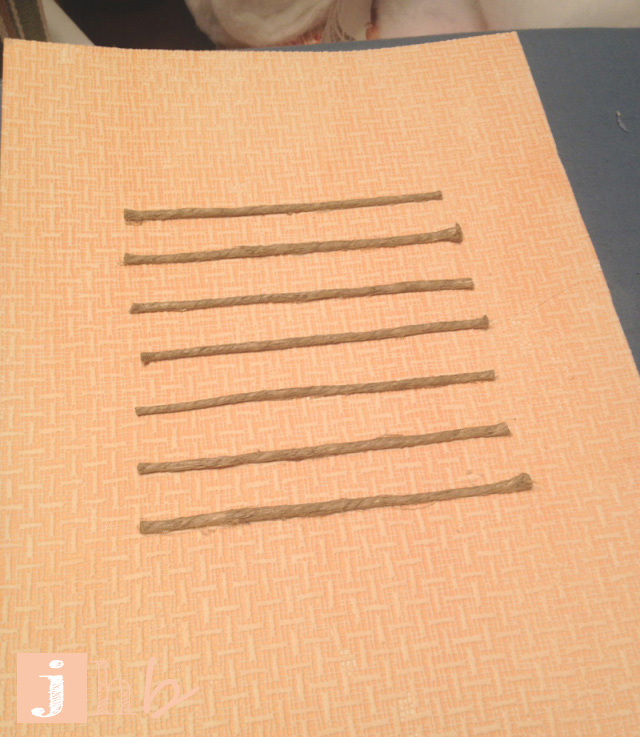
I had some trouble deciding what color these wallpaper / posterboard “mats” should be. I’m a very visual person so I did the below “mock up” to give myself an idea of what the final product should look like. Don’t worry, the twine taped on the paper makes sense in a minute.
The peachy coral in the center at the bottom was the winner! I mixed acrylic paint with water (and a little mod podge for some sheen) and used a simple sponge brush to paint it on.

Once they were dry, I hot-glued pieces of twine equal lengths apart in the middle of each mat.
Now the fun part! I popped them into the frames and hung them over our bed using a laser level. Please excuse the poor lighting in my poor iPhone pics. A photographer, I am not.

To be honest – I wasn’t that crazy about them at first but they’ve really grown on me. They have a sort of calming and serene quality – perfect for a room where we mainly rest! I’m feeling good about my progress thus far in this room, that’s certain.

Is anyone else getting good deals at the thrift shop? Who has made something that they didn’t like initially, but have come to love over time? Do tell…

Pingback: A Tale of Two Tables | jamie's home blog
Pingback: DIY Canvas Drop Cloth Textile Headboard | jamie's home blog
Pingback: Spray Painting Tips and Tricks | jamie's home blog